
August 2023 - September 2024
Growing Hope: Interactive Food Map
UX Reseach & Design
TEAM
Grace Ho
Sureet Sarau
Emily Veguila
SKILLS
UX Research
User testing
Interviews
UX/UI Design
Wireframing
Low Fidelity Prototyping
High Fidelity Prototyping
TOOLS
Figma
Qualtrics
Miro
Wordpress
Client
Since its conception in 2003, Growing Hope has worked alongside the Ypsilanti community to strengthen and support the local food system. Growing Hope seeks to connect food sovereignty with transformation, learning, justice, equity, integrity, and placemaking. One of the ways they pursue their mission is by providing a resource guide of affordable, fresh food sources and gardening resources in the local Ypsilanti area to promote sustainable food systems that are accessible to all.
Problem Statement
Currently, there are 4 different out-of-date versions of Growing Hope’s resource guides/maps available, and the guide is supposed to be a method for the organization to align users to the goal of food sovereignty and equitability, but the current state of the guide is not reaching its expectations. It is difficult for Growing Hope employees to update the guides from the backend, and all these guides are hard to locate for users. This is a problem because users who are seeking out the guides are frustrated and confused, Growing Hope cannot share recent and updated food equitability resources, and Growing Hope’s partner resources are facing a lack of visibility.
Goals
Create a new resource guide that users can easily access and comprehend
Merge information from the 3 various versions currently available
Have a new resource guide that is easy to update from the backend
Incorporate Growing Hope’s network of 500+ home growers into the new solution
Ensure the map is printable and responsive to desktop, mobile, and tablet views
Research Phase
Interviews
We conducted interviews with Growing Hope employees, who interact with the backend of the food map to update the information as well as employees who were entirely unfamiliar with the map. We collected this data to learn more about the needs and pain points of the food map internally by hearing the employees’ experiences. The data collected from these interviews aligned with our goal to increase employee ease of updating the map information, and aided us in improving their current experiences. (Here’s our interview guide if you’re curious about what kinds of questions we asked!) From there we were able to identify general themes and coded them into the chart below!

Surveys
We distributed surveys to both the community garden coordinators and the resource guide users through Growing Hope’s contact list. We want to hear about food map users’ experiences with the resource: what they typically utilize it for, what they like and dislike, and learn more about user behavior overall. This data helps us meet our user-centered goals of helping users filter our information and find the guide with greater ease. We administered a separate survey to the community garden coordinators to see what information they found most important to be shared with users, but found that it was difficult to get responses.
User Personas & Journey Map
From the data collected from our interviews and surveys, we were able to develop user personas and a user journey map. Our user personas represented the two main categories of users that would benefit Growing Hope’s resource guides— gardeners/farmers and consumers.


Design Requirements
Based on our interviews with Growing Hope employees, we compiled a design requirements document that describes some of our client’s requirements, wants, and needs for their ideal map. These helped us a lot in transitioning to the design phase!


Design Phase
Benchmarking & Sketching
Our early ideas were primarily inspired by benchmarking several websites with interactive maps, including Airbnb, Zillow, the University of Michigan’s campus map, and a map of farmers markets in Michigan that was sent to us during one of our Growing Hope employee interviews. By benchmarking, we were able to see several examples of different map UI’s– some utilizing a sidebar while others used a pop-up when the user hovered or clicked on a location – and incorporated similar ideas into our paper sketches. From our benchmarking, our team independently drafted quick sketches of a design solution for this product. We found the team’s initial ideas were all loosely based on the structure of the University of Michigan’s map, the Michigan Farmers Market Association’s map, and Airbnb’s map as they all had some type of key system and a sidebar pop-up exposing details about the location.
Wireframes
Our team developed some low-fidelity wireframes based on these initial sketches and our benchmarking! We weren’t sure which layout we liked the most from our benchmarking, so we made some variations and followed up with a cognitive walkthrough.

Mid-Fidelity Wireframes


Cognitive Walkthrough
Our team wanted to better learn what specific features users liked on all of the benchmarked platforms. To do so, the team conducted usability evaluations on all four of the benchmarks by conducting a cognitive walkthrough, asking users what they liked about the interfaces and what they would change. From the walkthrough we were able to gather insights that influenced our decision making for the next iteration of wireframes.
-
From the cognitive walkthrough, we found that users did not like how overwhelming the Michigan Farmers Market Association map is, as there is no organization to the map points and feels overwhelming. Users did prefer the color-coded filters and grouping available in the campus map, but found it difficult to find the sidebar filter. There was no difficulty in using the filters on the Airbnb map and users actually enjoyed this feature and its ease of use.
-
During the cognitive walkthrough, users liked how both the Airbnb and University of Michigan maps incorporated grouping of pins when zoomed out (i.e. showing one pin that demonstrates 10 listings in the general area instead of 10 individual pins and once clicked, the map will zoom into that region and show the individual pins). They showed disdain for all the independent pins in the farmers market map, as it just felt overwhelming and too much to process at once.
-
The peer critiques emphasized the idea that users will likely use their phones to find a location, especially if they are in the car, looking for a supplier, so we should also ideate designs on a mobile phone. While this idea may seem obvious, our team did not previously take this into consideration, as our designs solely focused on desktop versions.
-
During the cognitive walkthrough, users enjoyed the ease of zooming in and out on all the maps but disliked how the side panel that showed a list-view of the pins took up so much space from the map. The peer critiques also mentioned that they would like to see a list-only feature, instead of having a combined list and map design, as a list-only feature can showcase the information without taking away from the map and vice versa.
-
The peer critiques brought up another point of users that may be searching for a specific need and our current design does not allow for specific filtering. They suggested ideas like a search bar or advanced filtering outside of location type. This suggestion also aligned with our cognitive walkthrough, as users preferred the search bar in the farmers market map and advanced filtering in the Airbnb map for better, more refined discovery needs. The University of Michigan map also had these two features, but it was more hidden and difficult to locate for users.

Usability Testing
Our team conducted usability testing of these designs with current users of the guides. For the testing, we created a usability test log and a test plan to record the tasks, script, rationale for testing, a user’s ranking of task difficulty, the number of errors a user took performing the task, and the time it took for a user to perform the task.
The main feedback we received from our tests was general confusion surrounding the category filters and the advanced search options. Although the category filters were positioned beneath the search bar, they did not seem to be clickable options to the users. On the other hand, our mid-fidelity designs had included tags on each of the listings. These tags were not originally meant to be clickable, but since they were colored in, many users tried to click on them before the icons for the category filters. This sparked some debate on whether or not to make the tags clickable, but ultimately, we decided that making them clickable would make it confusing for users as it would offer multiple pathways to the same destination. Another piece of feedback we received was confusion surrounding the labels on our icons, particularly what distinguishes a farm from a garden and what “nature” means. We presented these issues at the standup to receive more feedback from our peers.
High-Fidelity Designing
Following the feedback from our cohort in the standup and our usability tests, we developed the first round of high-fidelity wireframes.


After completing the usability testing of the mid-fidelity prototypes, the team also gauged feedback on the first iteration of our high-fidelity design from peers and experts in the field. The following changes, with the rationale for the change, were made:
-
After consulting with Jim Rampton, a professional UX designer and professor at U-M, and our peers for feedback, both parties explained that the map view/list view button at the bottom of the screen seemed hidden and obtrusive. To remedy this, the team decided to change this button into a toggle switch with a map and list icon and move it to the header tab, next to the search bar. This way, the list and map view option is highlighted at the header alongside the other primary features and do not obstruct any cards or icons on the list and map, respectively. The visibility of this feature has now increased.
-
Based on user test results, the previous map icons that were based on location symbols seemed randomly placed and did not indicate an exact location on the map to users. Many users also did not think that they were clickable to expand and show more detailed location information. To remedy this and follow the consistency and standards heuristic, we have decided to adopt the generic pins that users will be able to recognize from any other apps or websites, such as Google Maps.
-
A common pattern we noted during the usability tests was that users mistook the location-type tags in the list-view location cards as clickable buttons. The team wanted to find methods to remedy this issue, as it was quite a common occurrence. During our peer reviews, an essential piece of feedback we received was that the location-type tags seemed redundant considering the filters above; if someone filtered for farms, they don’t need a symbol on the location cards to indicate farms. They suggested keeping tags in the longer-description pages of locations, but not in the default list-view page. By getting rid of these tags in the default list view page, we prevent potential errors while resolving the issue of redundancy.
-
Both usability testing and in-class feedback demonstrated that our design created confusion, as users were unable to decipher the differences between ‘location type’ and ‘services available’ filters. We decided to combine these 2 filters into one broader ‘location’ filter that encompasses both aspects of the location. The team decided it would be best to combine the two filters into one, ‘location filter,’ to improve clarity for users.
-
To also improve clarity and showcase that these are clickable buttons and not just aesthetic symbols to users, the team added a subtitle indicating ‘location filters’ above the primary location-type filters. Usability test results indicated that several users were unaware that the filters in the header were buttons/filters, and assumed that the buttons were designs that were added for aesthetics and had no functionality. In our mid-fidelity design, we had an advanced search option that had service filters such as “Wheelchair accessible” in a separate location from the ‘location filters,’ but our usability tests showed that users experienced confusion by having multiple filters in multiple places. By relocating the advanced search options to drop-down menus right beneath the location filters, the user is able to see all the filtering options in one place and apply them all at once without any unnecessary clicks or menus.
-
Usability testing showcased that many users either were unable to find the advanced filter button or were confused as to why there were primary and secondary filters, not understanding the hierarchical difference between the location type filter in the header and the advanced filters. Considering the abundance of confusion we received in regards to these filters, we decided to increase visibility and add these filters (distance, atmosphere, and hours of operation) to the header, underneath the location filters, as drop-down menu options. Since the secondary filters are located alongside the primary location filters, we hope that this design choice will significantly reduce the confusion that users initially had when accessing and utilizing these filters.
-
Our team decided to make this change because Dark blue as the primary color in this design makes information appear more legible when compared to the orange from the previous design Iteration. We did not have much flexibility when choosing the color scheme, font, or symbols within our designs, as we were following the brand style guide that our client provided us with. However, we found that the dark blue color in the brand guide is better at conveying text information on a white background than the orange color on the style guide. This is vital for ensuring good color contrast ratios for accessibility purposes.
With these changes in mind, we created our final designs and prototyped them. To prototype them, we had to create a site map to show the interactions. Then we put everything together!
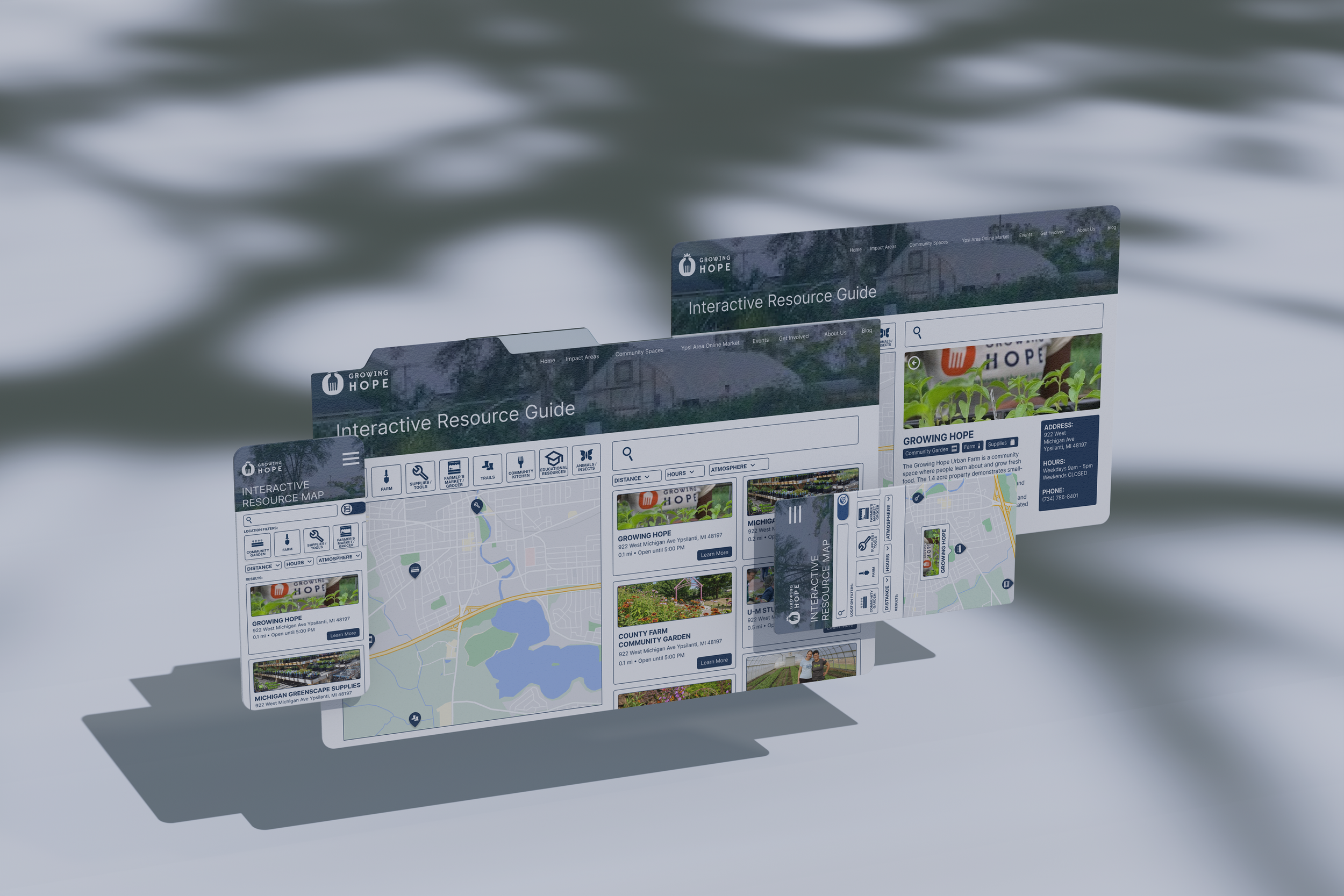
Site Map


Final High-Fidelity Screens & Prototypes


Presentation & Implementation
Our team was able to present our final designs to our client and our peers at the University of Michigan School of Information Design Expo! Not only did we get to present all of our research and our prototypes, but we were also able to see the research and design processes of the other capstone projects in our cohort.
We were also very lucky to be able to continue our work with Growing Hope beyond this capstone project as freelance UX designers to implement our designs into their website. Given the constraints of having to develop the interactive food map for a Wordpress website without plugin compatibility, we had to adapt our designs visually, but we kept our foundational work and met all our design requirements. You can check out the finished map here! An article was also published about the impact of our map on the Ypsilanti community and you can find that here!

Takeaways
This project with Growing Hope is one of the most impactful projects to my development as a designer. Not only was I able to see the project from start to finish, but I was able to experience and learn everything from UX researcher to UX designer and finally website developer. I’m grateful to have worked with a non-profit to be able to see how design can be used to positively impact a community.
Design Iterations
The development of our team’s final screens and prototypes required more iteration than I had done before in my past designs where they mostly streamlined from low-fidelity to high-fidelity with only a few changes. Throughout this project, we were constantly iterating from low to mid to high fidelity (and high fidelity again!) and we made changes based on several research methods— usability tests, cognitive walkthroughs, and A/B testing. Utilizing all of these methods has taught how valuable they can be even when a designer believes they’ve reached their final design.
Always Look for Feedback!
Every week our team would create a slide deck of our project progress for our class standup. During these standups, we would present our findings, future plans, ask questions for our peers, and receive feedback. These were extremely helpful, especially when we faced challenges that we needed more objective feedback to answer. It also helped cultivate a collaborative and professional environment!