
SafeHaven: App Interactions &
High Fidelity Prototype
August - December 2023
TEAM
Grace Ho
Ally Chang
Humaira Hamid
Zack Kirsner
Obiari Ugwu-Uche
SKILLS
UX Research
User testing
Interviews
UX/UI Design
Wireframing
Low Fidelity Prototyping
High Fidelity Prototyping
TOOLS
Figma
Canva
Miro
We created some personas that would target our primary and adjacent audiences, such as parents of our target audience, that could benefit from our app and its capabilities as well. These personas were developed with the interviews we had conducted in mind, since we had a better understanding of our users’ typical behaviors and their current frustrations with safety apps. Furthermore, we wanted to design for a diverse audience, so we ensured to include users with varying goals, technology skills, ethnicities, and personalities.
With these user personas, we were able to create scenarios of how our app could function to address different pain points.

Design Phase
User Flow
Having a better idea of different features we would want to explore on our app, we brainstormed together in person, generating different possible solutions and ideas to different scenarios and situations in which a user would want to use our app. Some ideas we tossed around included finding alternative routes home, informing others in the area of suspicious activity, checking in on their loved ones, calling someone, and access to emergency services. From there, we took those ideas and split them into the main functions that we were most eager to pursue and created a collaborative user flow on Miro!

Problem Statement
How might we compile tools for personal safety, such as emergency services and crime alerts, to reassure female presenting people from the paranoia and reality of violent crime while commuting (walking, taking a train, or bus) from dusk to dawn in dense American urban areas (12,000 or more people per square mile)?
This can be viewed as an interaction design problem in the realm of providing an efficient and accessible safety tool for our target demographic, giving them live updates to guide their commute and immediate access to assistance if needed along the way.
Goals
Accurately assessing a target audience's needs by drafting a problem statement, creating personas, and writing scenarios
Conducting research through interviews and user testing, analyze the data, and apply changes with an accessibility defect log
Creating a wireframe, low fidelity prototype, and a high fidelity prototype
Target audience
Women between the ages of 18-35, who have commutes to work or school in urban areas that have 12,000 or more people per square mile that require them to travel between sundown and sunrise on foot or public transit (train or bus) and are scared.
Some things to consider about smaller groups within this target audience:
Some women know self defense or carry their own weapons, so our app would not function as the primary source of safety or comfort for this subset of people. Because of that, our app is simply targeting paranoia more so than guaranteeing one’s actual safety.
Not all women in this position will have a smartphone with the same capabilities that can support this app, so we would have to make either a physical product or make sure that the app can still function on different devices
Although this is our target audience, our app is not limited to just being beneficial for women. Other vulnerable demographics, such as the elderly or younger adolescents might also find our app to be helpful for soothing their fears about getting home safe. If we were designing for these groups, we might include more instructions and tutorials on how to use the app since they may not be as knowledgeable about the interface or technology.
Research Phase
Interviews & Analysis
To understand our target audience better, we conducted two interviews each (Here’s a link to our protocol!). I interviewed 2 female individuals in their early twenties who have lived in cities that have a population density of over 12,000. P1 has lived in San Francisco (population density of 17,237) and P2 has lived in New York City (population density 29,000). Both use a combination of public transit and walking, while P1 also uses rideshares to travel around the city at night. This matches our target audience of women who have to travel at night (between sundown and sunup) in a densely populated area.
Some common themes:
The push to use technological resources over a physical product
The need for a way to contact authorities
GPS capabilities that can be used even when underground on a metro
A function that allows people to update their loved ones, keep in touch, and also share location
“[I would probably prefer] an app because the number one thing women fear in these encounters is getting disarmed and having their own weapon used against them.
”
This analysis would greatly factor into the ideation process in our storyboarding, sketching, and creating of personas of our target audience research.
Sketching, User Personas, & Scenarios
We started with sketching, just to ideate any scenarios or features of our product on our own before we came back together as a team to review each others’ sketches. These drawings were extremely informal and we focused more on quantity over quality for brainstorming purposes


We conducted a series of usability tests within our cohort and noted any issues in a usability defect log. Our test plan had four tasks on it based on the main interactions on our app and we each ran one usability test per task with a different participant for each.
Imagine your friend suggested this app. Now you are interested and want to create an account. However, before you create the account, you want to learn more about the app and set up your preference for agents in the future. What would you do? (testing onboarding)
Imagine you are walking home alone at night and although you aren’t in any immediate danger, you feel you want to talk to someone. How would you connect to an agent? (testing non-emergency hotline)
Imagine that you are walking home by yourself at night and there are no foreseeable threats, but you would like to chat to an agent. If the situation were to escalate to become dangerous, how would you navigate to call 911? (testing transition from non-emergency to emergency situation)
If you are in danger but cannot make any obvious sound, how would you connect to an agent and get help?
(testing agent chatbox feature)
Some changes we made based on the usability test results:
-
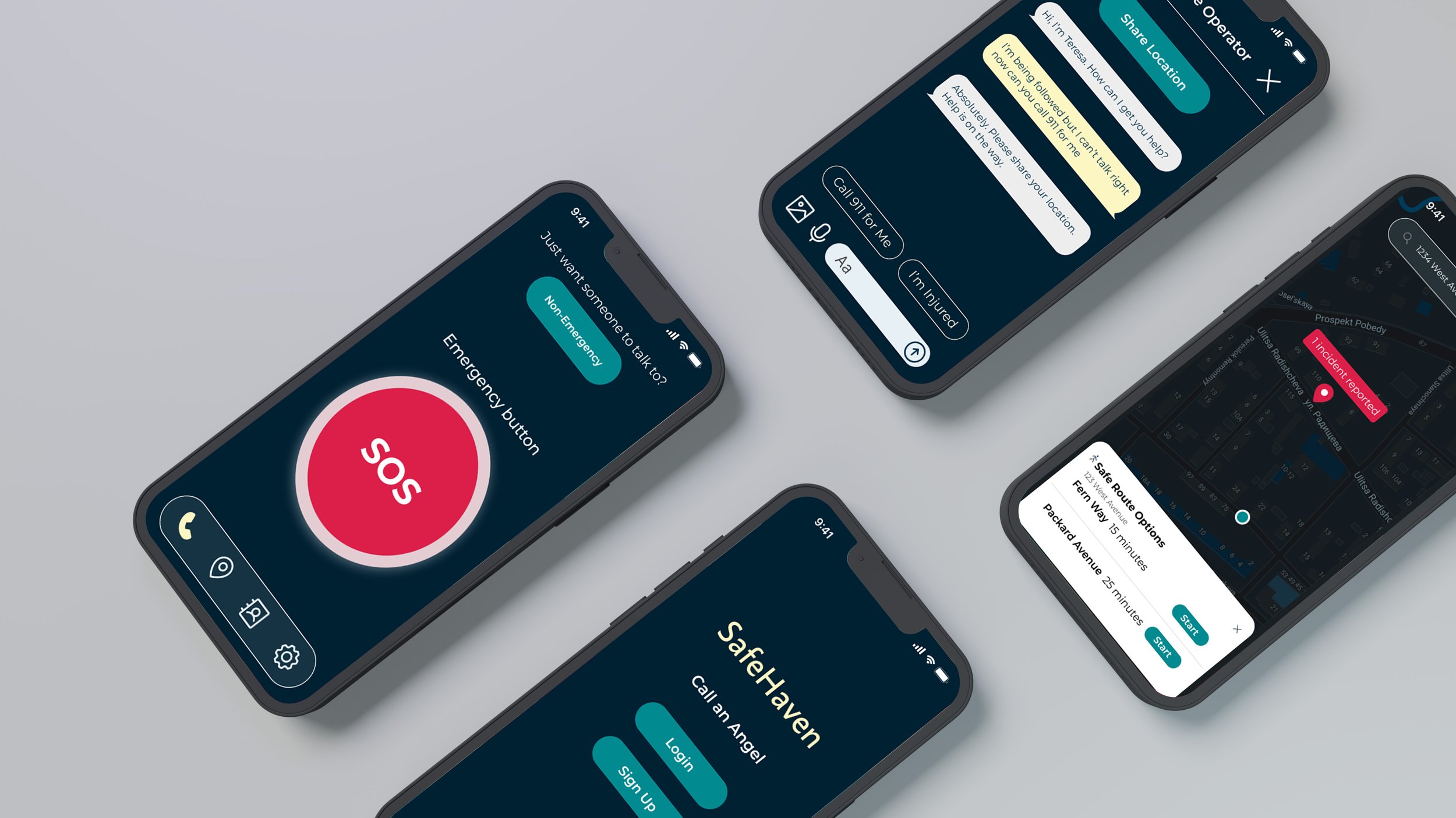
The primary task that we asked our participant was to complete the onboarding process which required them to set preference for the app before creating an account. We designed to include the setting preferences for their desired agents (such as language or gender, etc.) in the onboarding process as a mandatory step before they can create an account. The participant was able to navigate through the onboarding process and complete the task without major struggle. However, they mentioned that during the first landing page they were a little hesitant to choose between the “signup” button and the “walk me through” button as they were not sure if the later one will lead them to create an account. They also suggested that the swipe feature for the demonstration guide was not obvious enough. To mitigate these confusions, we decided to remove the “signup” button and only keep the “walk me through” as the later one provides the same functionality, and we also included indicators that show the demonstration videos/pictures steps are swipeable.
-
The participants had no difficulty testing the non-emergency button with the given instructions, and their only suggestion was regarding the icon of the finger pointing down to the “Help” button. They noted that it was the first thing that they noticed when they opened that section of the app, rather than the “Help” button itself, or the instructions above it. As such, we may need to rearrange elements on the screen in order to increase the likelihood of the “Help” button being the first perceived element, or eliminate the icon entirely.
One major proposed solution was to make sure we reduced distraction and put emphasis on the “Help” button as it should be the first thing that catches the user's attention. To do so, we removed the “pointing” icon and only kept the description and the help button, as well as reducing the font weight and size of the description for the help button to reduce distraction. Additionally, we considered removing other elements from the page such as the non-emergency button, but eventually decided not to because it could cause more confusion for users who may not know that there are more capabilities to the app than calling 911— an action they can do on their own phone without our app.
-
The participant was able to navigate from a non-emergency situation into an emergency situation with ease and described it as “straightforward” due to the clear labels on each button. However, they did ask why the “Chat with a Buddy” button was above the “Chat with an Agent” button when it seemed that an agent would be preferred in terms of efficiency and professionalism in a situation that would be more urgent or scary to the user. They also noted that if the user was holding the phone to their ear, there is a possibility that they could accidentally hit the “Call 911” button and transition it to an emergency situation.
High-Fidelity Prototype & Report
We generated some ideas for the color palette using Adobe’s color palette generator and the keyword “Safety” before we ultimately combined some color palettes to make one that would easy to see when walking in the dark and not too obvious. We wanted to utilize calming colors to reassure our users, but also have a strong accent color to emphasize important features such as our panic button. Thematically, we decided to name our app SafeHaven with the idea that our app could act as a “guardian angel,” watching over our user until they get home safely from their commute. After developing our final prototype, we compiled a report on our process and presented it to our peers. Take a look at both below!

Takeaways
Looking back at this project, I’m grateful to have the experience of playing a role in every part of developing this app. I was able to gain insight into what a UX researcher does, while also gaining insight into what a UX/UI designer does. In this project, I felt that I really did get that experience of developing a digital product and seeing the entire process play out. If this product were to be finished, I imagine that we would have a lot more user testing to do and that we would continue to iterate upon this design to give our users the assurance they need when they’re trying to get home.
Simplicity is Key
As a more visual designer, I’ve always taken on projects where I’ve been more of a creative lead or pushing the bounds of branding and how visually appealing an app can be. In the case, I realized that more visual stimuli and graphics are not always the best, especially when it takes away emphasis from what is most important. Sometimes simplicity is best and sometimes I have to retire the artist’s beret to remember that visual cues to guide the user through the interface are more important than adding graphics or more design elements.

Low-Fidelity Prototype & User Testing
To being wireframing, we drew out some paper prototypes before we moved to digital prototyping utilizing Figma. First we created a basic wireframe to outline the features we wanted to work on, including onboarding, a panic button, and capabilities to reach emergency services. Throughout this process, we also learned to use UI kits for iOS.

-
Katie has just finished her shift at the restaurant, around 11 PM. She normally travels back to her apartment alone, as none of her coworkers live in the same part of Boston as her. She had always been taught to be cautious traveling alone at night, especially in a big city, so she opens her phone to see if she could call an Uber, but unfortunately surge pricing is in effect and she doesn’t want to spend an unreasonable amount of money. Thus, she decides to walk home, as she thinks it's less risky than public transportation at this hour. She doesn’t know the city very well, so she uses her phone to provide her directions as she’s walking home. About 10 minutes into her walk, she receives a notification saying that there’s been suspicious activity along her route, and offers her a slightly longer, but safer, alternate route. Katie opts to take the other way home, and arrives home safely
-
On Friday night around 1am, when Anna was about to go to bed, her phone rang with an unfamiliar number shown. She picked up the phone and heard a stranger’s voice. It was the police calling her to let her know that her daughter, who was a freshman in college, was drunk and taken to the police station by someone on the street. She felt relieved that her daughter was safe. However, she always felt worried about these situations because she suffered from the trauma of sexual assault when she was a college student herself. She wished that there was a way to check her daughter’s safety since her daughter is a college student that lives in a big city and goes out to bars a lot at night. She also hopes that she will get notified when her daughter is about to be in danger.
Throughout the process of creating our scenarios, we were able to effectively break down the behaviors of our personas and put our design problem into context by stepping into their shoes and viewing their experiences through their perspective. By empathizing with our personas, we could visualize the possible pain points that our users could have, in addition to visualizing user motivations, needs and goals. The ability to visualize these things is able to help us conceptualize the solution and how we can go on to design our app in a way that is able to meet those needs and goals. To help us structure our scenarios, we focused on mapping out various goals each persona may have, and actions and events that may take and encounter in order to reach those goals. This process not only provided us with a clearer understanding of what our users need, it also helped us solidify what features we want on our app. We were able to ideate what features played a key part in our solution and the varying contexts in which our users could utilize them. Ultimately, the scenarios were immensely helpful in helping us further understand the scope of our project and what we need in order to move forward to the design phase.