
November - December 2024
Poseidon Project Moderated Testing & Redesign
TEAM
Grace Ho
Kevin Zhang
Zoe Zapata
SKILLS
UX Research
Moderated testing
UX/UI Design
High Fidelity Prototyping
TOOLS
Figma
Miro
Userlytics
Panelfox
Problem
The Poseidon Project is a centralized resource bank that equips the public, activists, and policymakers with credible information to make educated decisions about the future of aqua farming. Our research explores the functionality of the Rauch Foundation’s website. We aim to address issues with usability, responsive design, and accessibility, which hinders the Poseidon Project’s goal of spreading awareness on an imperative issue.
Goals
Our client had some main goals that determined our focus for this redesign.
Determine if users can understand the scope of the Poseidon Project and its activities.
Determine if the terminology used on the website is clear to an inexperienced user and if it helps a user effectively navigate the platform.
Evaluate the ease of accessing the information and features available on the website.
Determine if researchers and specialized users can find and utilize resources relevant to their needs.
Understand how successful the website is in educating novice users and encouraging them to learn more about topics of interest.
Research Phase
We began with meeting with our client where we discussed our goals and explored the interface!
Moderated Testing
First, we designed tasks that aligned with our client’s goals. Here are some of the main ones that contributed to our data:
-
What is the Poseidon Project?
Based on the navigation, what function do you think each page has?
These questions allowed us to gage if the mission of the Poseidon Project was clear to first time users!
-
What tools and features do you find most useful for finding the information you’re most interested in seeing? Are there tools you wish you had to find this information?
Do you think this is a useful tool for finding resources about this subject? Why or why not? (Goal 6)
Is there anything that you’d like to see that isn’t here?
-
Is this the information you expected to find?
Why did or didn’t you choose “Campaigns and Coalitions”?
-
What do you think this page is used for?
What information can you get from this page?
We utilized Panelfox and Userlytics to recruit users that were interested in aquaculture and sustainable food systems and then conducted 6 moderated user tests. We used an affinity board to organize our data and choose which pain points and features we wanted to focus on in our redesign.

Problems & Recommendations
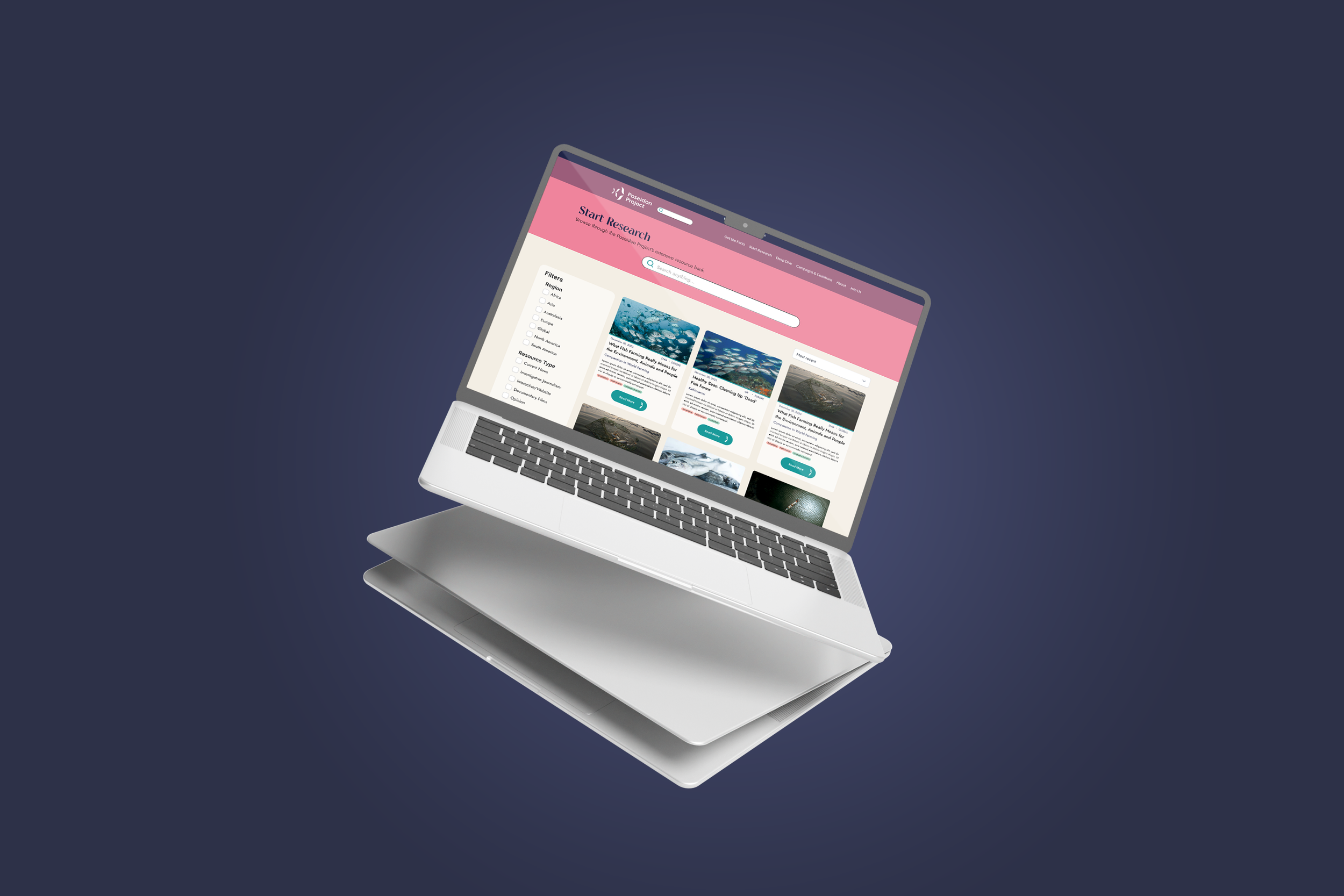
Start Research Redesign
Problem:
Based on our findings from the affinity board, we found that when many of our participants were looking for specific resources, they would attempt to use the global search bar first. Currently, Start Research’s local search is hidden away by the Quick Search button, but many users did not notice it or could not find it. Some users also found the information to be formatted too densely, which made navigating through content to be overwhelming. Users also commented on having to double click to view the tags.
Reorganizing Navigation & Briefs page
Problem:
The current navigation bar is a poor reflection of the true purposes of the web pages and fails to assist the intended user flow. The current order takes users on an explorative user flow to obtain an overview (Get the Facts), and conduct research (Start Research), but interrupts the user flow with the ability to join organizations (Campaign and Coalitions). The second flow, an investigative flow, is interrupted as users go from "Register" to learning about the organization (About) to "Briefs", which continues the explorative flow. "Register" and "Briefs" confused users about the purpose of the pages. Users mistook "Register" for joining the actual project and signing up for a mailing list. Many users recommended using "Join Us", the current page header, since it better reflected the form on the page. Many users were also confused by "Briefs". Many did not understand the actual intent of the page and found the function of the current page to be a duplicate of Start the Research.

An Open-Ended Journey
Problem:
As an information website with multi-layers of information hierarchy, accessible navigation to drill down into more detailed research would be quintessential to align with the Poseidon Project’s objectives. Research from the user testing sessions have revealed that participants struggled to navigate through the pages due to a lack of clarity and continuity within the page’s objectives.

Recommendation:
Through our moderated testing, we found that many users defaulted to using the search first when looking for a resource, so we made the search bar more prominent and accessible to users. The original drop down categories were moved to a sidebar to function as filters to narrow searches and make browsing easier. We reformatted resources into cards to improve information hierarchy and to make the content less visually overwhelming. This also improved issues of padding or margins between each resource.


Recommendation:
To better improve the user flow and communicate the purposes of each web page, the navigation bar had titles renamed and re-ordered. The "Briefs" page was transformed into "Deep Dive" to present a holistic view of the robust information on the website.
The new navigation bar was renamed and re-ordered titles to better guide an explorative user flow. The new order separated the two user flows (exploratory and investigative). Users now obtain an overview (Get the Facts), conduct Research (Start Research), and end the explorative journey with Deep Dive: a holistic view of the previous material. "Join Us" is placed at the end with a background color to visually separate itself from other pages, as it is the only page that calls to action.
The "Briefs" page is renamed "Deep Dive" to represent the new page's purpose. Users are now able to dive deeper into the curated articles, documents, and other materials in a holistic view. The content is presented in a carousel format to reduce the amount of cards users see at once. The buttons are changed to chevrons to convey functionality and encourage users to interact with the content. The materials are separated by topic, allowing users to obtain an overview of the materials related to each topic and discover topics.
Recommendation:
As a means to provide continuity within the user journey, our team initially suggested a fixed “Back to the Top” button or a side-menu that provides a quick, accessible change between pages. Within the user pools that we observed, we also noticed that users tend to scroll back onto the header’s many rather than use the quick links located within the footer. After many trials and tribulations over different prototypes, a dedicated “Learn More” section above the footer would serve the greatest efficiency in retargeting the users’ attention in the research journey while communicating a context of each pages’ objectives.
Takeaways
Moderated Testing & Analysis
From this project, I learned the value of moderated tests. I have also learned how to read and analyze the data from them to make design changes to a website/product. Based on the data, I am able to make an informed decision about how to improve the usability of the Poseidon Project is. If I were to do this project again, I would choose to have more users to test because I want a bigger sample for more accurate analysis of data trends.