Aug
—
Dec 2023
SafeHaven: Building Interactions for Safety
Context
Problem
How might we compile tools for personal safety, such as emergency services and crime alerts, to reassure female presenting people from the paranoia and reality of violent crime while commuting (walking, taking a train, or bus) from dusk to dawn in dense American urban areas (12,000 or more people per square mile)?
This can be viewed as an interaction design problem in the realm of providing an efficient and accessible safety tool for our target demographic, giving them live updates to guide their commute and immediate access to assistance if needed along the way.
Goals
Accurately assessing a target audience's needs by drafting a problem statement, creating personas, and writing scenarios
Conducting research through interviews and user testing, analyze the data, and apply changes with an accessibility defect log
Creating a wireframe, low fidelity prototype, and a high fidelity prototype
Target Demographic
Women between the ages of 18-35, who have commutes to work or school in urban areas that have 12,000 or more people per square mile that require them to travel between sundown and sunrise on foot or public transit (train or bus) and are scared.
Some things to consider about smaller groups within this target audience:
Some women know self defense or carry their own weapons, so our app would not function as the primary source of safety or comfort for this subset of people. Because of that, our app is simply targeting paranoia more so than guaranteeing one’s actual safety.
Not all women in this position will have a smartphone with the same capabilities that can support this app
Although this is our target audience, our app is not limited to just being beneficial for women. Other vulnerable demographics, such as the elderly or younger adolescents might also find our app to be helpful for soothing their fears about getting home safe. If we were designing for these groups, we might include more instructions and tutorials on how to use the app since they may not be as knowledgeable about the interface or technology.
Research
Interviews
To understand our target audience better, we conducted two interviews each (Here’s a link to our protocol!).
Participants


Common Themes
The push to use technological resources over a physical product
The need for a way to contact authorities
GPS capabilities that can be used even when underground on a metro
A function that allows people to update their loved ones, keep in touch, and also share location

Sketching
We started with sketching, just to ideate any scenarios or features of our product on our own before we came back together as a team to review each others’ sketches. These drawings were extremely informal and we focused more on quantity over quality for brainstorming purposes.

User Personas
We created some personas that would target our primary and adjacent audiences, such as parents of our target audience, that could benefit from our app and its capabilities as well. These personas were developed with the interviews we had conducted in mind, since we had a better understanding of our users’ typical behaviors and their current frustrations with safety apps.


Design
User Flow
Having a better idea of different features we would want to explore on our app, we brainstormed together in person, generating solutions and ideas to different scenarios in which a user would want to use our app. Once we had those ideas, we created a user flow to show our app's main interactions and use cases.


Wireframes
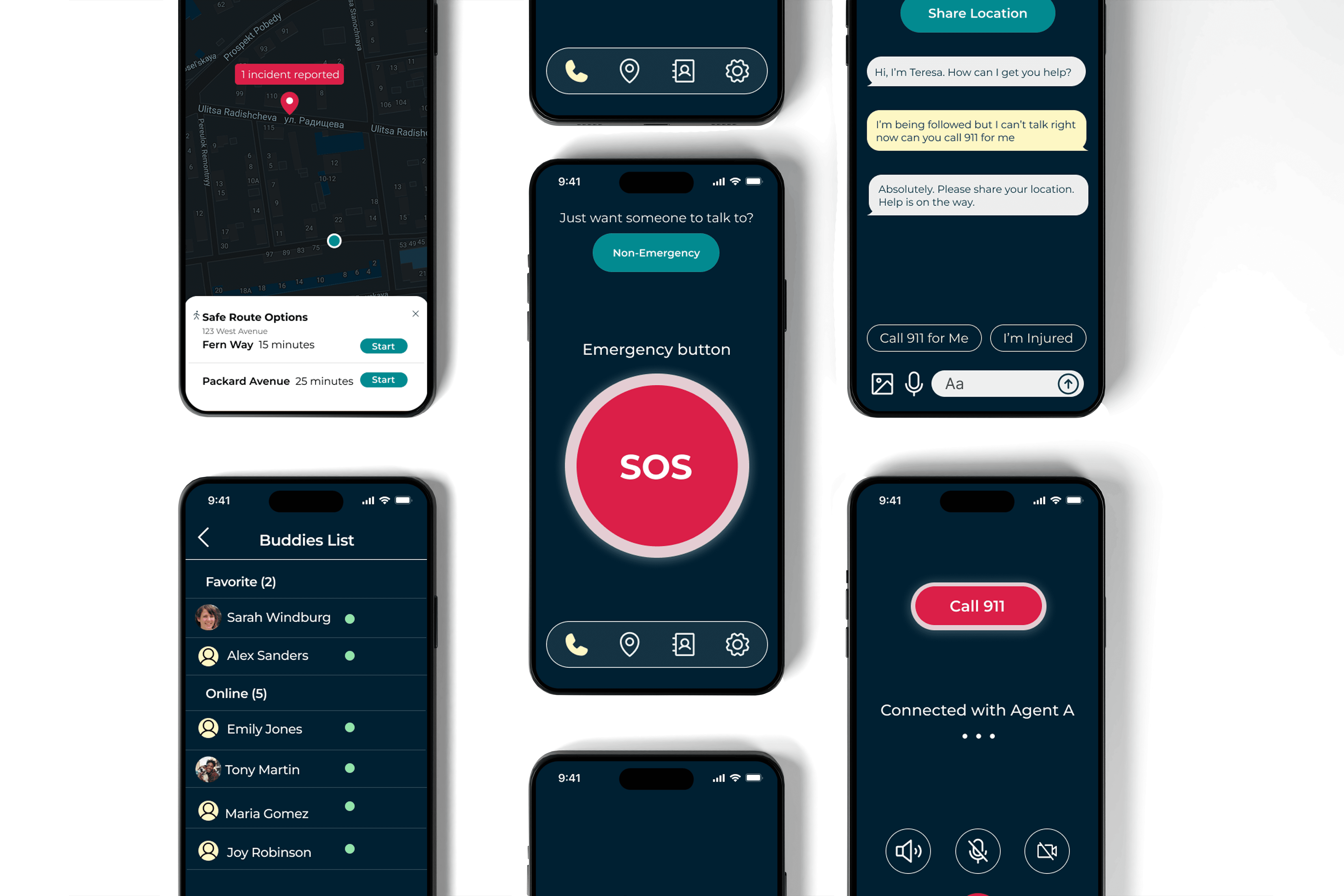
We created a basic wireframe to outline the features we wanted to work on, including onboarding, a panic button, and capabilities to reach emergency services. Throughout this process, we also learned to use UI kits for iOS.


User Testing
We created some basic interactions based on our user flow and then conducted a series of usability tests within our cohort and noted any issues in a usability defect log. Our test plan had four tasks on it based on the main interactions on our app and we each ran one usability test per task with a different participant for each:
Imagine your friend suggested this app. Now you are interested and want to create an account. However, before you create the account, you want to learn more about the app and set up your preference for agents in the future. What would you do? (testing onboarding)
Imagine that you are walking home by yourself at night and there are no foreseeable threats, but you would like to chat to an agent. If the situation were to escalate to become dangerous, how would you navigate to call 911? (testing transition from non-emergency to emergency situation)
Imagine you are walking home alone at night and although you aren’t in any immediate danger, you feel you want to talk to someone. How would you connect to an agent? (testing non-emergency hotline)
If you are in danger but cannot make any obvious sound, how would you connect to an agent and get help? (testing agent chatbox feature)
We made some changes based on our insights:
Button placement: Making sure users would not accidentally call 911 while calling in a non-emergency situation
Help button emphasis: Considering sizing and removing distractions from the homepage
Final Prototype
High Fidelity Design Choices
We wanted to utilize calming colors to reassure our users, but also have a strong accent color to emphasize important features such as our panic button. Thematically, we decided to name our app SafeHaven with the idea that our app could act as a “guardian angel,” watching over our user until they get home safely from their commute.


Conclusion
I learned that simplicity is key. As a visual designer, I’ve always pushed the bounds of branding and explored how visually appealing an app can be. In the case, I realized that more visual stimuli and graphics are not always the best, especially when it takes away emphasis from what is most important.
Next Steps
Prototype and design a method for people to proactively check in with their buddies
Explore integrations with pre-existing safety apps
Develop methods for users to warn other users of dangerous situations in their area