Mar
—
May 2026
Building a LEGO Design System Brick by Brick
Role
UX Designer
Tools
Figma
Zeroheight
Skills
Component design
UX writing
Usability testing
Grace Ho
Rae Kim
Federico Sarno
Aswathi Thilak
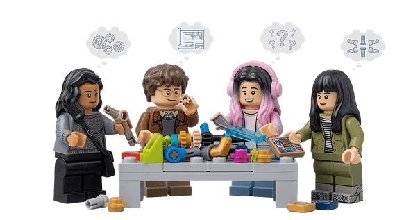
Team
Context
Let's leg godt.
LEGO was founded in 1932 on two Danish words - Leg Godt. Play well. It is the most recognizable toy brand on the planet, sold in 120+ countries with 31,000+ employees and a sprawling digital ecosystem anchored by LEGO.com. The brick has always been a system of parts that snap together. The website wasn't. Klods is the design system we built to fix that.

Problem
The LEGO website is built from hundreds of one-off decisions.
LEGO.com is the flagship digital touchpoint for a brand built on consistency. But pulled apart, the site read like hundreds of one-off decisions stacked on top of each other. Every page, feature, and component on lego.com is being designed and built in isolation with no shared language between teams. The result is a product that looks and feels different depending on where you are.
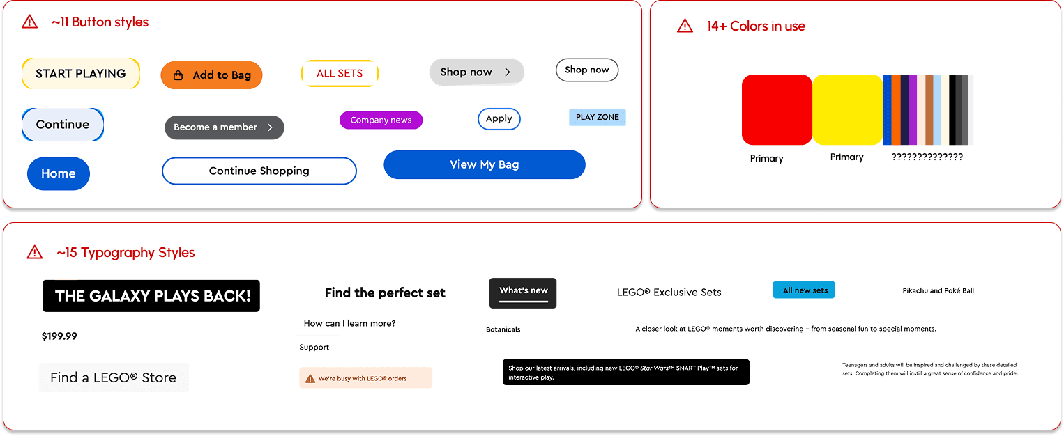
11 button styles. 14 colors. 15 typography treatments. One website.
We audited the LEGO website surface. The numbers above came from a single site. Multiple card styles, two accordion patterns, dropdowns that behaved differently depending on which page they showed up on. When there's no shared component library, each team solves the same UI problem independently, which added up to a site that felt like it was assembled from multiple LEGO kits.
Some of LEGO's best builders couldn't fully use the site
LEGO's audience is one of the most diverse in the world with kids and parents with disabilities to aging superfans. Not every city has a huge LEGO store so the website serves as primary touchpoint for users to buy their favorite products. Right now, the website has barriers that shut some of them out.
I used WAVE, an accessibility checker browser extension, to identify errors across the LEGO website and the homepage alone showed several issues.
Color contrast failures: Multiple contrast failures across text, labels, and UI components.
Missing alternate text: Images across product pages, banners, and editorial content are missing descriptive alt text, invisible to screen readers.
Broken heading structure: Heading levels are skipped or missing entirely on key pages, breaking navigation for screen reader and keyboard users.

Web Accessibility Evaluation Tool (WAVE) indicates 41 missing alt texts, 5 color contrasts, and 1 missing ARIA reference
Solution
Klods is the Danish word for a LEGO brick, and just like the brick itself, this system is built to connect.
Klods is a design system created to give LEGO designers a shared foundation: a cohesive set of tokens, components, and guidelines that work together to deliver a consistent experience across the LEGO virtual world.
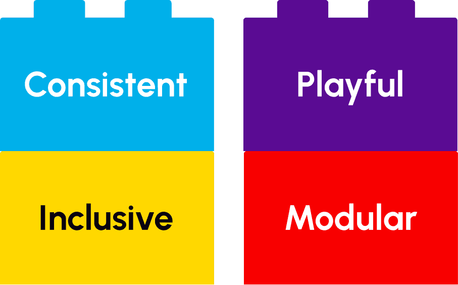
The values stacked behind Klods
Consistent: Klods enforces consistency through shared tokens, documented patterns, and a single source of truth for every repeating decision so that users don't have to relearn behaviors for different components.
Inclusive: LEGO has always been a toy for everyone and we want to ensure our digital experience is no different. Every piece of Klods is checked for accessibility to ensure anyone and everyone can use it.
Playful: Small moments of delight that show up in motion, color, and detail that remind users what LEGO is for without compromising clarity.
Modular: Just like a LEGO set, Klods is modular-- it makes the system sustainable so that new components and templates can be easily built from our foundations.
Klods' Modularity: update the brick, not the building.
The system architecture follows a five-layer logic: Design Tokens, Foundations, Components, Templates, Experience. As tokens are updated, the updates carry onto the foundations, components, and templates to feed into the overall LEGO experience.

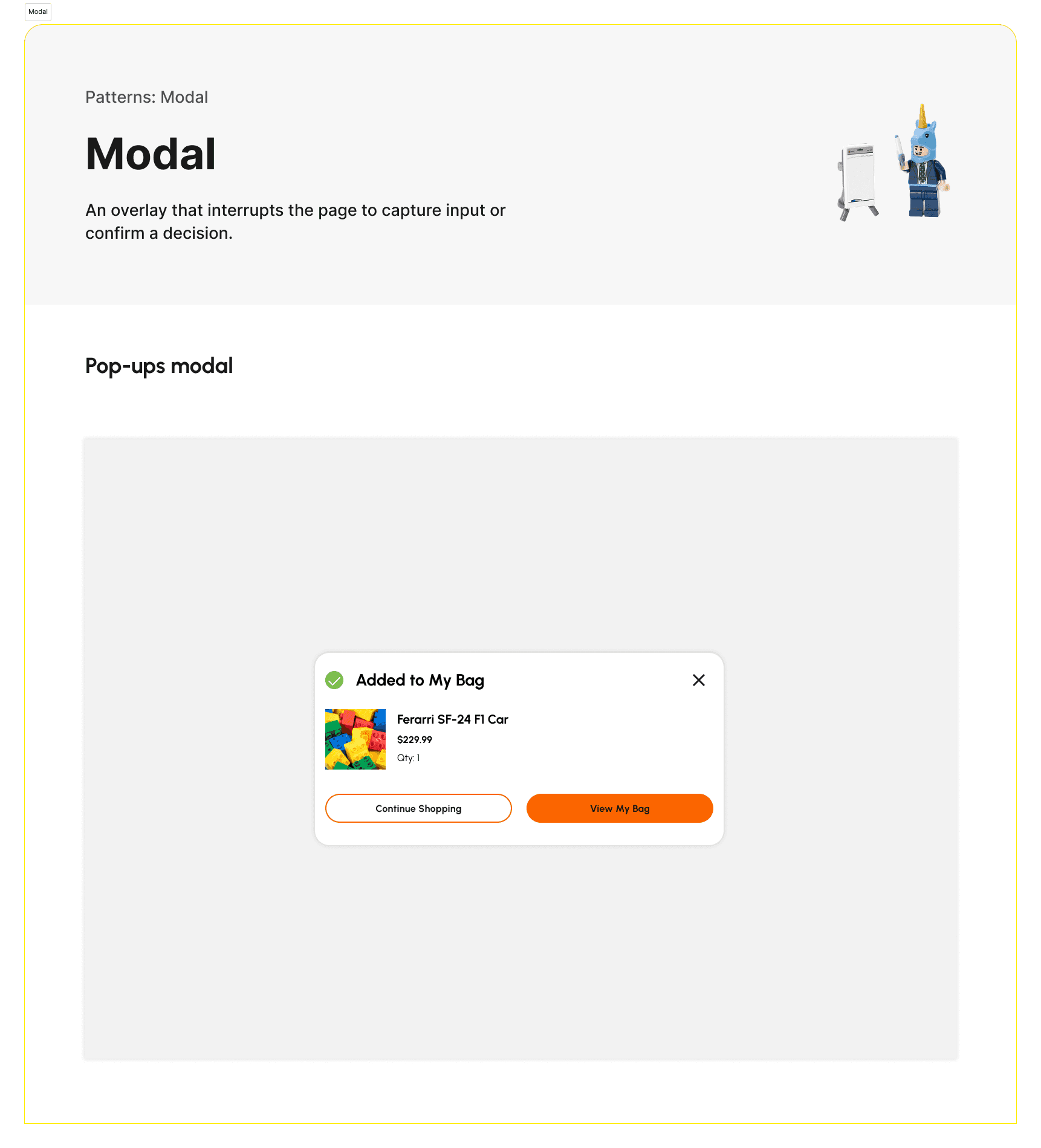
The ultimate toolbox: a fully stocked Figma UI kit.
The Figma UI kit we shipped contains 100+ components, 10 templates, and 16 variants. It covers branding, color, typography, spacing, icons, media, and every common pattern from cards to carousels to global navigation.

An instruction manual for LEGO's digital experience builders.
The Klods design system is not just a UI kit, it also contains a documentation site that clearly defines each piece for consistency, instructional guidelines, and resources to ensure users have all the support they need.

Accessibility wasn't a layer we added.
It was the foundation we built on.
After doing our accessibility audit, there was no choice but to ensure that all of the pieces of our UI kit can be used by every LEGO fan. Our kit was tested to work on both light and dark backgrounds to suit LEGO's themed set needs. Every component should be operable by keyboard, switch, and voice. Focus states are visible by default. Pulling a Klods text token onto a Klods surface token is already a compliant pairing. A designer reaching for a Klods button is reaching for an accessible button.
I wrote up a section on our approach to accessibility on our documentation website and included links to accessibility checkers in our resource section to ensure that the inclusive principle of Klods is always maintained as web accessibility guidelines update over time.

Process
Deconstructing the old system.
We started by taking apart the LEGO website and grouping together components to analyze the visual consistency. Then, we annotated the original system to come up with four key insights for what to keep and what had to improve.

Key Insights
Inconsistency ran through everything. The team noticed a lack of color and typography theme throughout the LEGO website, which created an overstimulating environment for the users.
Accessibility mostly held up, but with real gaps. Color contrast passed in some places, holding above 4.5:1, and LEGO's signature yellow was avoided as a text color to protect legibility. But alt text was missing across product pages, banners, and editorial content, and heading hierarchy was broken on key pages.
The brand voice was a strength. Copy was playful and intentional. LEGO figures appeared in ways that felt on-tone. The editorial register aligned with what LEGO has always been.
Spacing was too tight. Padding between elements left almost no breathing room. Pages felt crowded, and visual hierarchy suffered for it.
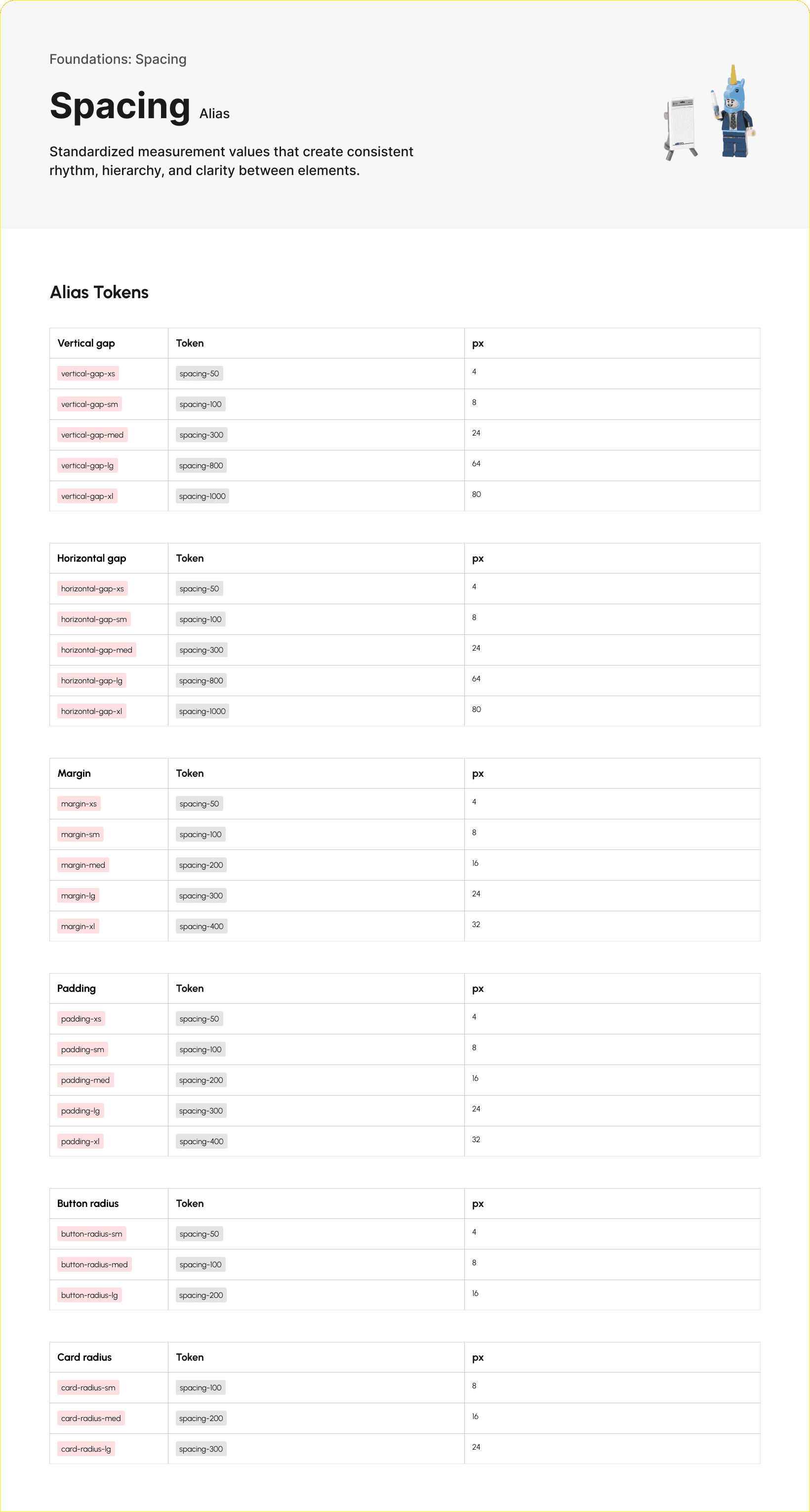
Laying the foundation for a shared language with a design token system.
We created a system by consistently labelling our primitive tokens and then transitioning them to alias tokens. These tokens would ensure that designers and developers using our system would be able to communicate using a simple, shared language.
For this segment of Klods, I specifically developed the spacing tokens.

Using building blocks to make our components.
Our team built the Figma UI kit together, tackling new components every week and reviewing each other's work. This is where we were able to pare down many of the inconsistent styles on the current LEGO website as we discussed what styles matched the rest of the design system. We also made decisions to get rid of certain style components, such as dividers (thin lines that split cards into different sections) as we felt that they didn't serve their purpose in reducing visual clutter.
I built components and variants for buttons, pagination, navigations, and modals.

Designing the kit is half the work. Using it is the other half.
We each conducted a user testing session in the style of contextual inquiry with another designer. During this session, the participant was directed to recreate a page with our UI kit alone to test for how intuitive the components were.
Key Insights
The system needed a layer between component and experience. Testers wanted a "pattern" or "template" tier to group components into reusable layouts, and asked plainly what counts as a pattern versus a component.
Docs make the system usable, not extra polish. Cards needed usage examples, Getting Started needed an intro, and definitions were missing where designers expected to find them.
Documentation has to teach, not just describe. Testers couldn't tell whether the layout grid page was a structural overlay or a mockup with grids baked in.
Components break in real use in ways they don't break in isolation. Resizing a card revealed auto layout that worked at default and failed when stretched.
What landed without explanation is worth marking too. The order summary card came back as a clear win, a reference for components still being refined.

Developing the instructional manual for future designers.
We created a framework to provide consistent documentation in our Zeroheight site. We also included Getting Started and Support pages to ensure that designers can intuitively navigate our site and design system with our instruction alone.
Each documentation page includes:
Design overview
Anatomy
Variants
Items (that are contained within components)
Guidelines/Best practices
Use cases
My contributions included the documentation for logo, spacing, media, modal, and header navigation. I also wrote the Meet Klods, Getting Started, Changelog, Support, Contact Us, Contribution Policy, and Accessibility pages. I standardized the format for all of our Zeroheight site in the final check before our pitch.

Pitch
Pitching for Klods' success.
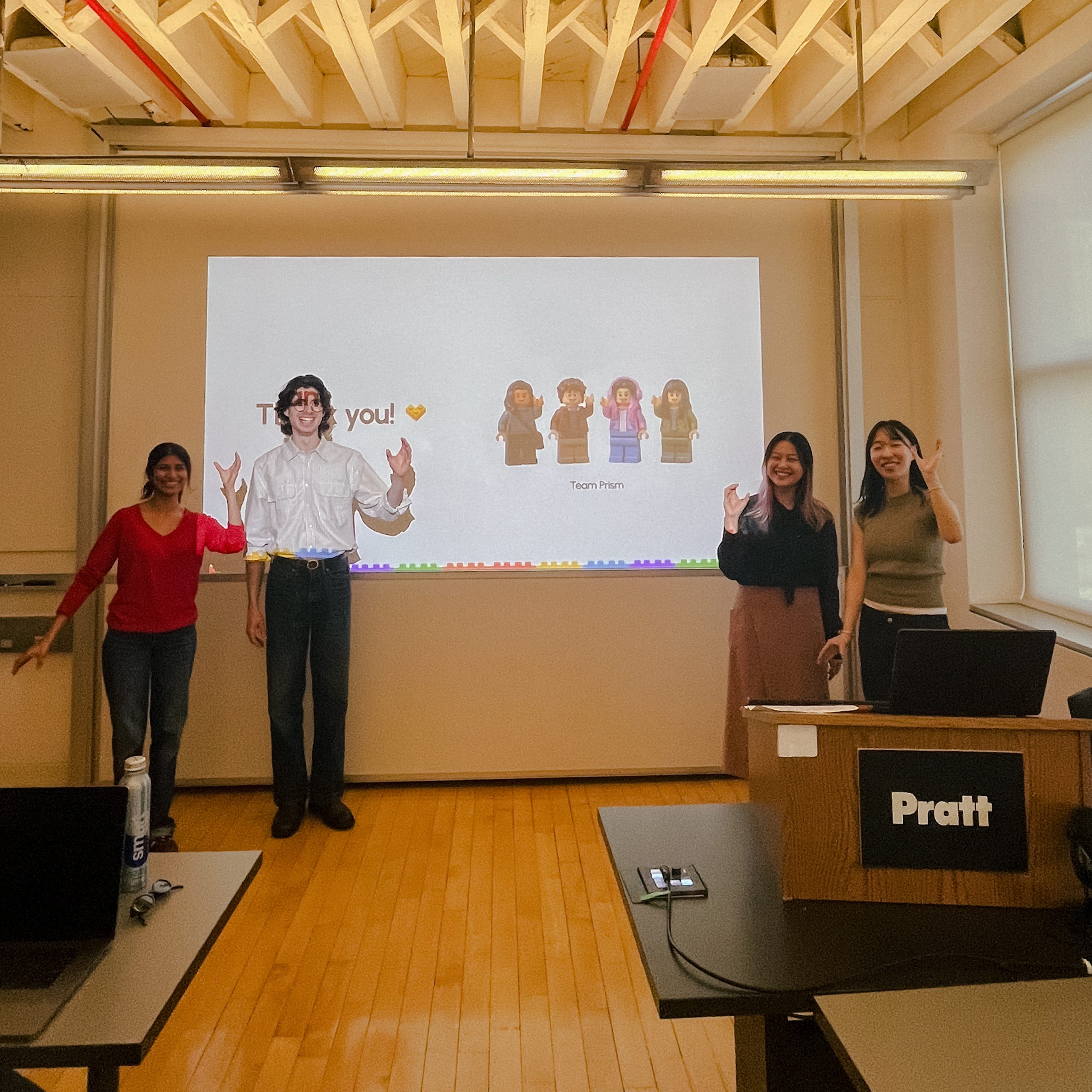
At the end of our three month span of developing Klods, we pitched it to our class posed as product leads at LEGO. We received great feedback, especially on our consistent use of LEGO's playful branding throughout our pitch and designs.
Want to experience Klods?
Take a look at our completed UI kit, documentation, and pitch deck below!
Build the brick, not the building: a reflection.
It's cliche to say that teamwork is one of my biggest takeaways from this project, but it truly is! I feel so lucky to have worked with a team that was equally passionate about this project and taking on its challenges. We followed through with our team norms, split work equally, and communicated well. Whenever one of us needed help, we all jumped into action. Setting those expectations early was one of the best decisions we could have made and contributed to our greater success.
Viewing design systems as greater than just the UI kit was the mantra of this course and also contributed to the success of Klods. I learned to view systems not just as a designer, but also in the shoes of product managers, developers, and other users who needed to share a language. In the past, I always saw design systems as just components built for consistency, but now I see that consistency is just one benefit in the collaboration across teams.